In spring 2015 a group from Indiana University looked at attendance lists from all conferences, 1994-2014 and created this map, which can be seen in this blog article.
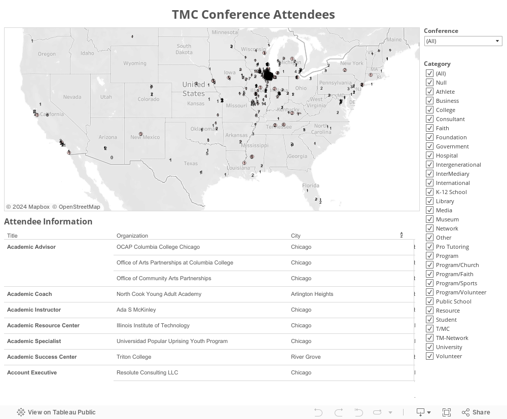
In January 2016 the same information was use to create the
map below, showing conference
participation, by location, organization, and type of
organization.
The view you're looking at shows participants have come from all over the United
States, but mostly from the Chicago area. Zoom in and you
can see participation from the Chicago region. This space has been created
to offer discussion about the conferences, and the maps of participation.
Join
this forum on Ning.com and discuss the implications of this information.